2. Plotting fits
Giulio Caravagna
21 November, 2025
Source:vignettes/a2_plotting.Rmd
a2_plotting.RmdThis vignette describes the plotting functions available in
mobster. As an example, we use one of the available
datasets where we annotate some random mutations as drivers.
# Example data where we have 3 events as drivers
example_data = Clusters(mobster::fit_example$best) %>% dplyr::select(VAF)

# Drivers annotation (we selected this entries to have nice plots)
drivers_rows = c(2239, 3246, 3800)

example_data$is_driver = FALSE
example_data$driver_label = NA

example_data$is_driver[drivers_rows] = TRUE
example_data$driver_label[drivers_rows] = c("DR1", "DR2", "DR3")

# Fit and print the data
fit = mobster_fit(example_data, auto_setup = 'FAST')
#>  [ MOBSTER fit ]
#>
#> ✔ Loaded input data, n = 5000.
#> ❯ n = 5000. Mixture with k = 1,2 Beta(s). Pareto tail: TRUE and FALSE. Output
#> clusters with π > 0.02 and n > 10.
#> ! mobster automatic setup FAST for the analysis.
#> ❯ Scoring (without parallel) 2 x 2 x 2 = 8 models by reICL.
#> ℹ MOBSTER fits completed in 8.6s.
#> ── [ MOBSTER ] My MOBSTER model n = 5000 with k = 1 Beta(s) and a tail ─────────
#> ● Clusters: π = 54% [C1] and 46% [Tail], with π > 0.
#> ● Tail [n = 2227, 46%] with alpha = 1.1.
#> ● Beta C1 [n = 2773, 54%] with mean = 0.48.
#> ℹ Score(s): NLL = -5332.99; ICL = -10291.86 (-10614.88), H = 323.01 (0). Fit
#> converged by MM in 11 steps.
#> ℹ The fit object model contains also drivers annotated.
#> # A tibble: 3 × 4
#>      VAF is_driver driver_label cluster
#>    <dbl> <lgl>     <chr>        <chr>
#> 1 0.448  TRUE      DR1          C1
#> 2 0.159  TRUE      DR2          Tail
#> 3 0.0629 TRUE      DR3          Tail

best_fit = fit$best
print(best_fit)
#> ── [ MOBSTER ] My MOBSTER model n = 5000 with k = 1 Beta(s) and a tail ─────────
#> ● Clusters: π = 54% [C1] and 46% [Tail], with π > 0.
#> ● Tail [n = 2227, 46%] with alpha = 1.1.
#> ● Beta C1 [n = 2773, 54%] with mean = 0.48.
#> ℹ Score(s): NLL = -5332.99; ICL = -10291.86 (-10614.88), H = 323.01 (0). Fit
#> converged by MM in 11 steps.
#> ℹ The fit object model contains also drivers annotated.
#> # A tibble: 3 × 4
#>      VAF is_driver driver_label cluster
#>    <dbl> <lgl>     <chr>        <chr>
#> 1 0.448  TRUE      DR1          C1
#> 2 0.159  TRUE      DR2          Tail
#> 3 0.0629 TRUE      DR3          Tail
Model plots
The plot reports some fit statistics, and shows the annotated drivers if any.
plot(best_fit)
#> Warning: Using `size` aesthetic for lines was deprecated in ggplot2 3.4.0.
#> ℹ Please use `linewidth` instead.
#> ℹ The deprecated feature was likely used in the mobster package.
#>   Please report the issue at <https://github.com/caravagnalab/mobster/issues>.
#> This warning is displayed once every 8 hours.
#> Call `lifecycle::last_lifecycle_warnings()` to see where this warning was
#> generated.
#> Warning: The `<scale>` argument of `guides()` cannot be `FALSE`. Use "none" instead as
#> of ggplot2 3.3.4.
#> ℹ The deprecated feature was likely used in the mobster package.
#>   Please report the issue at <https://github.com/caravagnalab/mobster/issues>.
#> This warning is displayed once every 8 hours.
#> Call `lifecycle::last_lifecycle_warnings()` to see where this warning was
#> generated.
#> Warning: The dot-dot notation (`..count..`) was deprecated in ggplot2 3.4.0.
#> ℹ Please use `after_stat(count)` instead.
#> ℹ The deprecated feature was likely used in the mobster package.
#>   Please report the issue at <https://github.com/caravagnalab/mobster/issues>.
#> This warning is displayed once every 8 hours.
#> Call `lifecycle::last_lifecycle_warnings()` to see where this warning was
#> generated.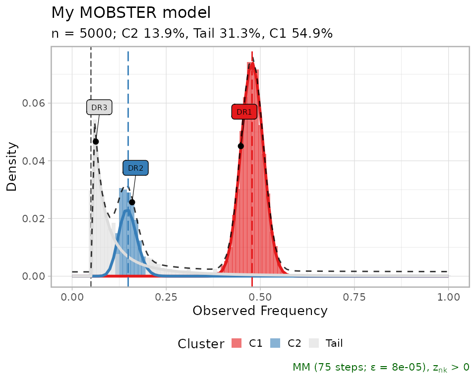
One can hide the drivers setting is_driver to
FALSE.
copy_best_fit = best_fit
copy_best_fit$data$is_driver = FALSE

plot(copy_best_fit)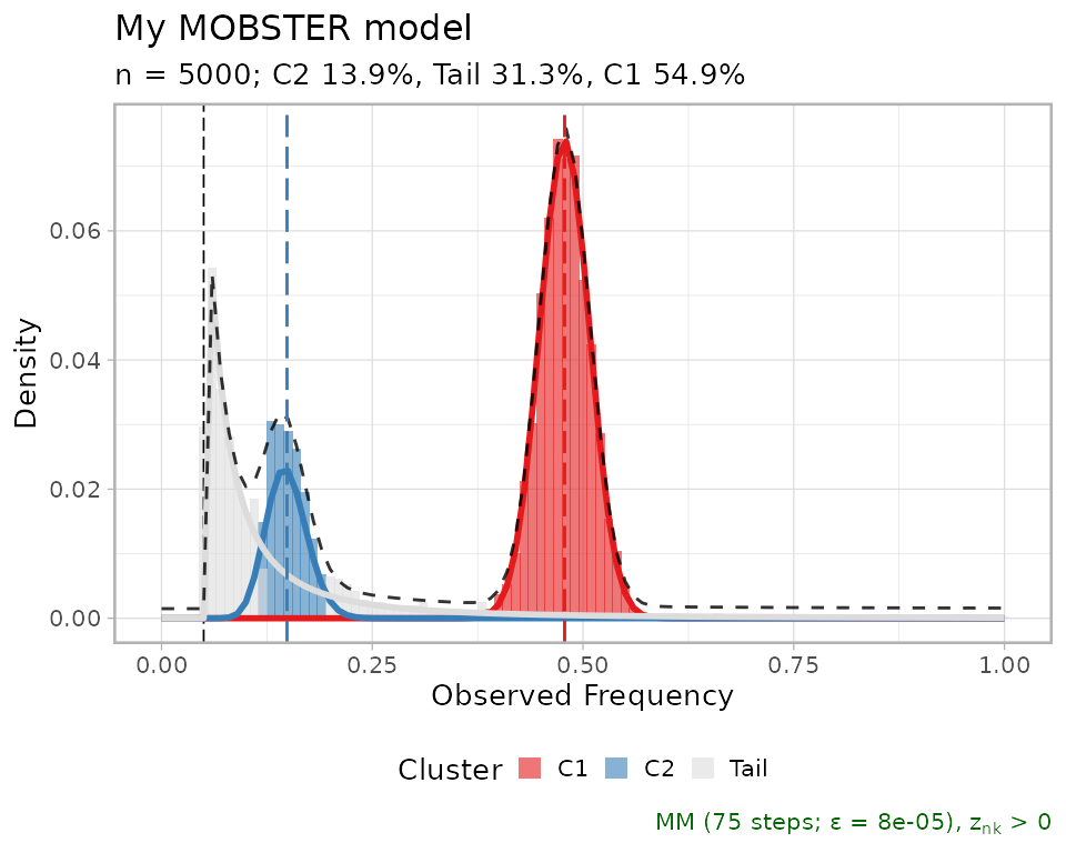
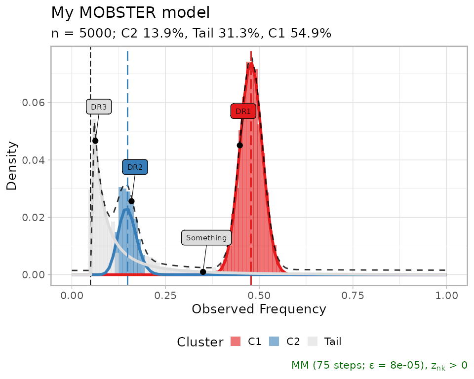
It is possible to annotate further labels to this plot, providing
just a VAF value and a driver_label value. Each annotation
points to the VAF value on the x-axis, and on the corresponding mixture
density value for the y-axis.
plot(best_fit,
     annotation_extras =
       data.frame(
         VAF = .35,
         driver_label = "Something",
         stringsAsFactors = FALSE)
     )
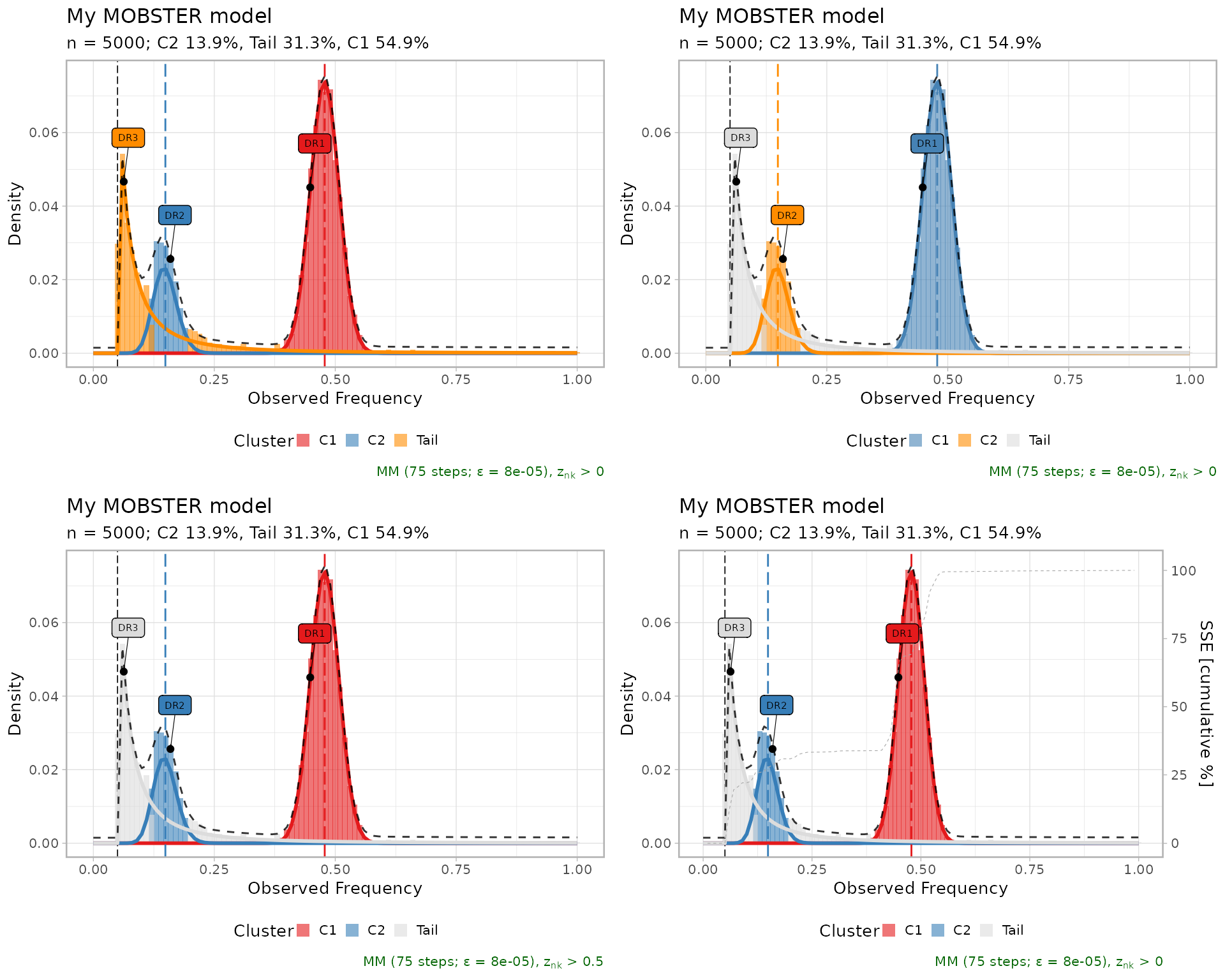
Other visualisations can be obtained as follows
ggpubr::ggarrange(
  plot(best_fit, tail_color = "darkorange"),                  # Tail color
  plot(best_fit, beta_colors = c("steelblue", "darkorange")), # Beta colors
  plot(best_fit, cutoff_assignment = .50),                    # Hide mutations based on latent variables
  plot(best_fit, secondary_axis = "SSE"),               # Add a mirrored y-axis with the % of SSE
  ncol = 2,
  nrow = 2
)
Fit statistics
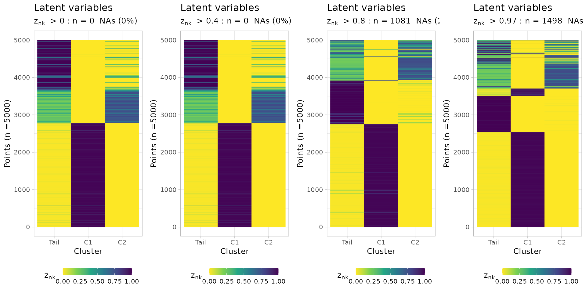
You can plot the latent variables, which are used to determine
hard clustering assignments of the input mutations. A
cutoff_assignment determines a cut to prioritize
assignments above the hard clustering assignments probability.
Non-assignable mutations (NA values) are on top of the
heatmap.
ggpubr::ggarrange(
  mobster::plot_latent_variables(best_fit, cutoff_assignment = 0),
  mobster::plot_latent_variables(best_fit, cutoff_assignment = 0.4),
  mobster::plot_latent_variables(best_fit, cutoff_assignment = 0.8),
  mobster::plot_latent_variables(best_fit, cutoff_assignment = 0.97),
  ncol = 4,
  nrow = 1
)
You can plot a barplot of the mixing proportions, using the same colour scheme for the fit (here, default). The barplot annotates a dashed line by default at 2%.
plot_mixing_proportions(best_fit)
#> Warning in geom_text(data = NULL, aes(label = "2%", x = 0.1, y = 0.04), : All aesthetics have length 1, but the data has 2 rows.
#> ℹ Please consider using `annotate()` or provide this layer with data containing
#>   a single row.
#> Warning: No shared levels found between `names(values)` of the manual scale and the
#> data's colour values.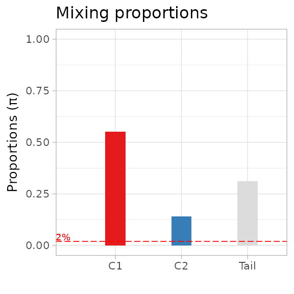
The negative log-likelihood NLL of the fit can be plot
against the iteration steps, so to check that the trend is decreasing
over time.
plot_NLL(best_fit)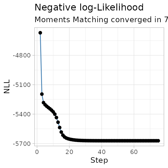
A contributor to the NLL is the entropy of the mixture,
which can be visualized along with the reduced entropy, which is used by
reICL.
plot_entropy(best_fit)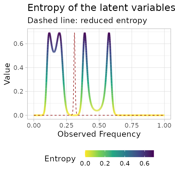
Inspecting alternative fits
Alternative models are returned by function mobster_fit,
and can be easly visualized; the table reporting the scores is a good
place to start investigating alternative fits to the data.
print(fit$fits.table)
#> NLL BIC AIC entropy ICL reduced.entropy
#> 1 -5332.989 -10614.876 -10653.979 323.0129 -10291.863 0.0000
#> 5 -5301.274 -10551.444 -10590.547 375.9632 -10175.481 0.0000
#> 2 -5332.968 -10589.282 -10647.937 2179.1747 -8410.107 1894.6576
#> 4 -4442.905 -8834.707 -8873.810 544.0527 -8290.654 544.0527
#> 3 -1570.709 -3115.867 -3135.419 0.0000 -3115.867 0.0000
#> reICL size K tail
#> 1 -10614.876 6 1 TRUE
#> 5 -10551.444 6 1 TRUE
#> 2 -8694.625 9 2 TRUE
#> 4 -8290.654 6 2 FALSE
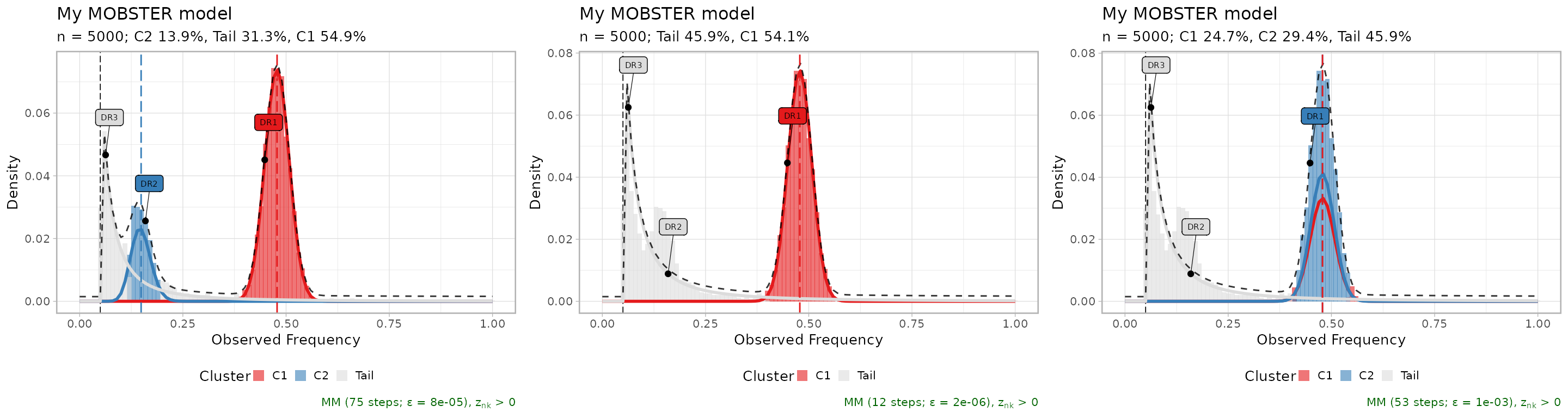
#> 3 -3115.867 3 1 FALSETop three fits, plot in-line.
ggpubr::ggarrange(
  plot(fit$runs[[1]]),
  plot(fit$runs[[2]]),
  plot(fit$runs[[3]]),
  ncol = 3,
  nrow = 1
)
The sum of squared error (SSE) between the fit density and the data
(binned with bins of size 0.01), can be plot to compare
multiple fits. This measure is a sort of “goodness of fit”
statistics.
# Goodness of fit (SSE), for the top 3 fits.
plot_gofit(fit, TOP = 3)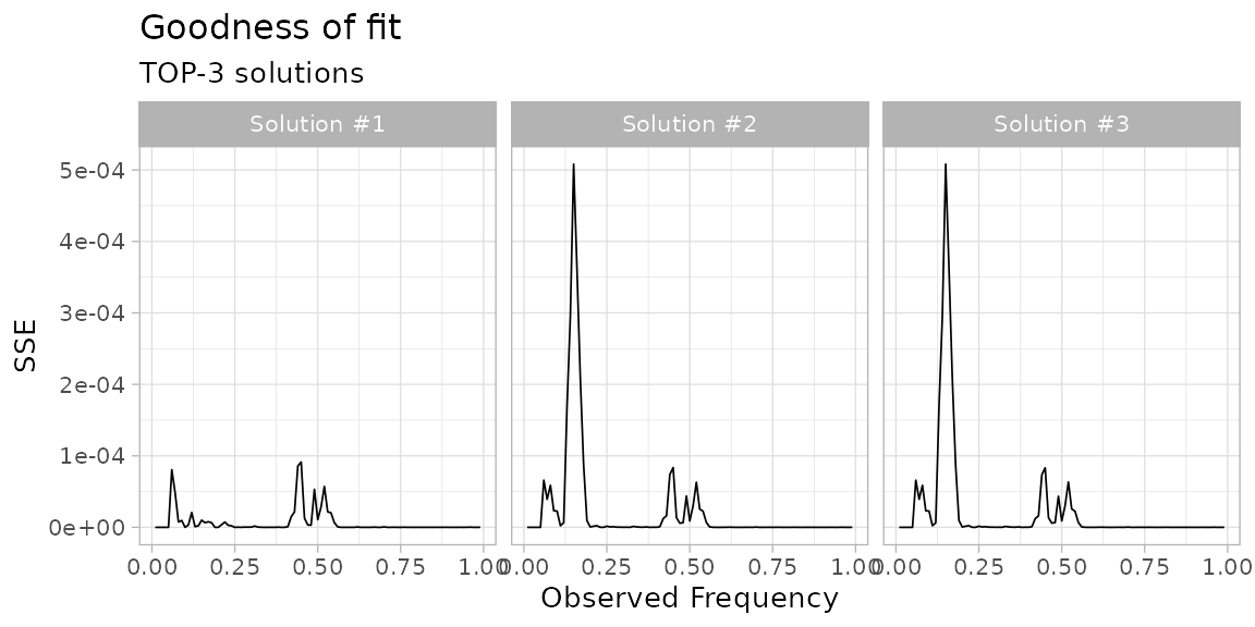
The scores for model selection can also be compared graphically.
plot_fit_scores(fit)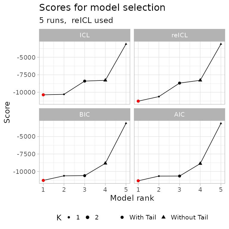
In the above plot, all the computed scoring functions
(BIC, AIC, ICL and
reICL) are shown. This plot can be used to quickly grasp
the best model with, for instance, the default score
(reICL) is also the best for other scores. In this graphics
the red dot represents the best model according to each possible
score.
Model-selection report
A general model-selection report assembles most of the above graphics.
plot_model_selection(fit, TOP = 5)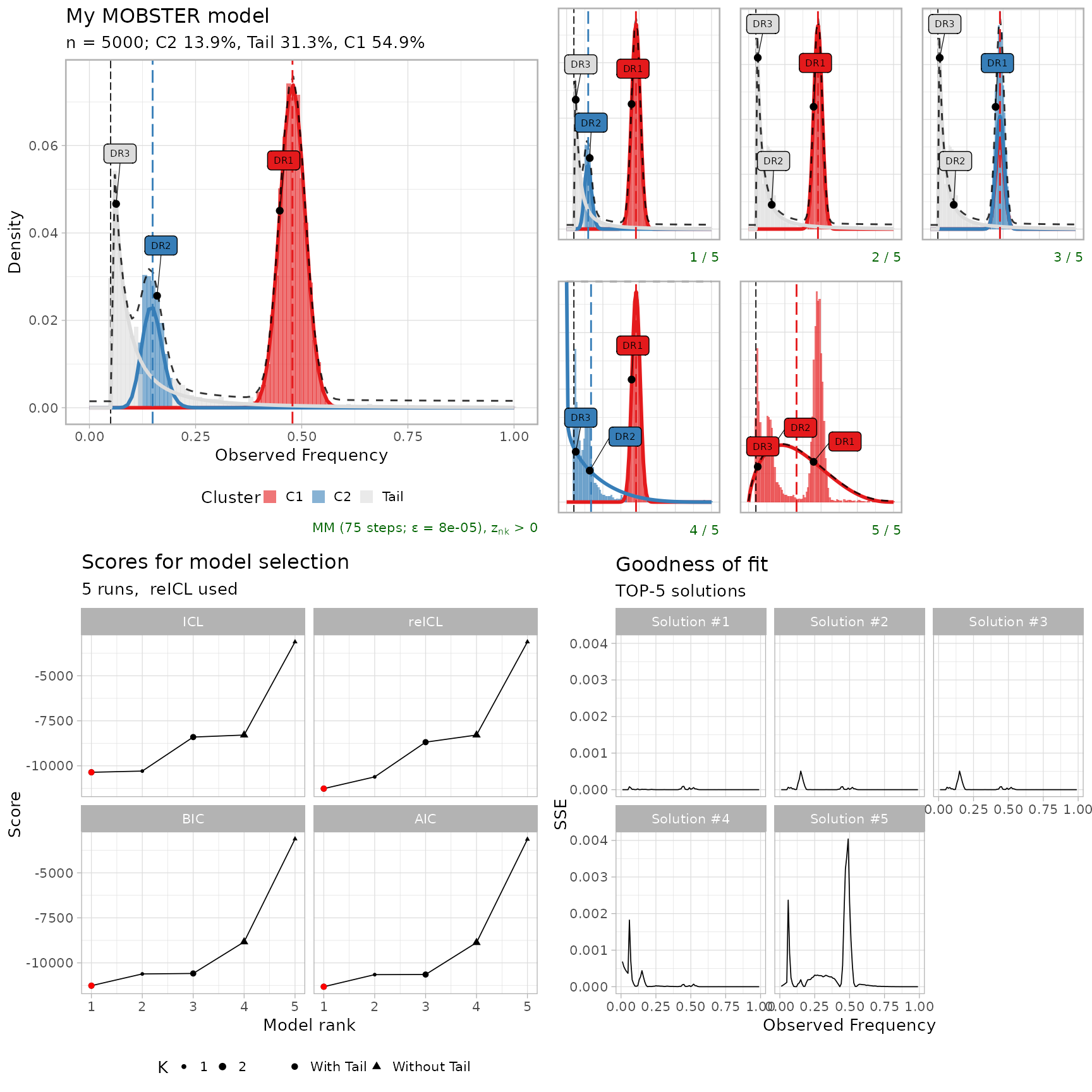
Fit animation
It seems useless, but if you want you can animate
mobster fits using plotly.
example_data$is_driver = FALSE

# Get a custom model using trace = TRUE
animation_model = mobster_fit(
  example_data,
  parallel =  FALSE,
  samples = 3,
  init = 'random',
  trace = TRUE,
  K = 2,
  tail = TRUE)$best
#>  [ MOBSTER fit ]
#>

# Prepare trace, and retain every 5% of the fitting steps
trace = split(animation_model$trace, f = animation_model$trace$step)
steps = seq(1, length(trace), round(0.05 * length(trace)))

# Compute a density per step, using the template_density internal function
trace_points = lapply(steps, function(w, x) {
  new.x = x
  new.x$Clusters = trace[[w]]

  # Hidden function (:::)
  points = mobster:::template_density(
    new.x,
    x.axis = seq(0, 1, 0.01),
    binwidth = 0.01,
    reduce = TRUE
  )
  points$step = w

  points
},
x = animation_model)

trace_points = Reduce(rbind, trace_points)

# Use plotly to create a ShinyApp
require(plotly)

trace_points %>%
  plot_ly(
    x = ~ x,
    y = ~ y,
    frame = ~ step,
    color = ~ cluster,
    type = 'scatter',
    mode = 'markers',
    showlegend = TRUE
  )