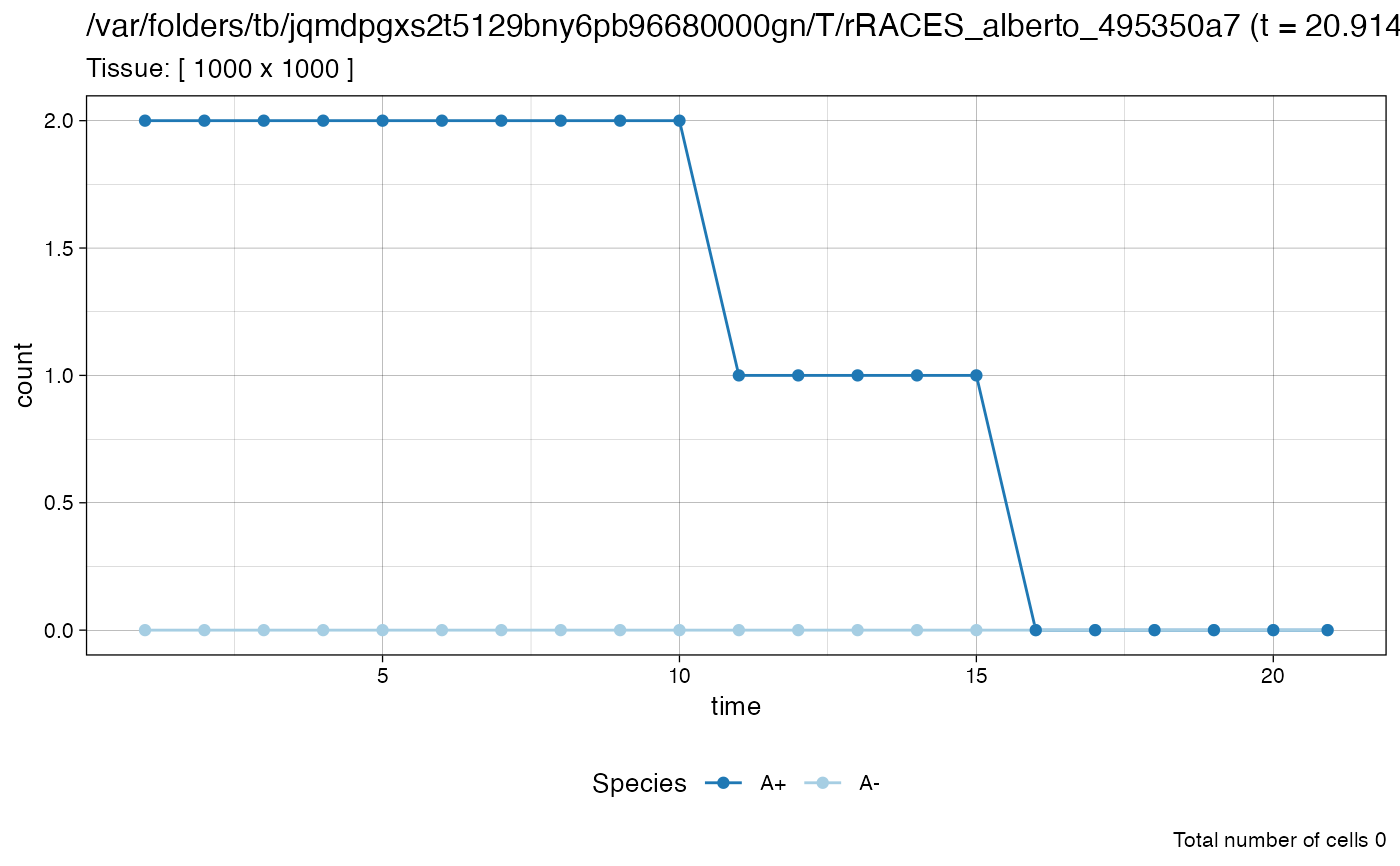
A pie chart with population counts, split by species and epigentic state. It also provides annotations for the simulation data.
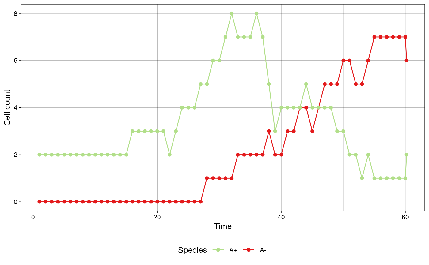
Examples
sim <- SpatialSimulation()
sim$history_delta <- 1
sim$add_mutant(name = "A",
               epigenetic_rates = c("+-" = 0.01, "-+" = 0.02),
               growth_rates = c("+" = 0.2, "-" = 0.08),
               death_rates = c("+" = 0.1, "-" = 0.01))
sim$place_cell("A+", 500, 500)
sim$run_up_to_time(60)
#>
 [████████████████████████████████████████] 100% [00m:00s] Saving snapshot


plot_timeseries(sim)


# define a custom color map
color_map <- c("#B2DF8A", "#E31A1C")
names(color_map) <- c("A+", "A-")

plot_timeseries(sim, color_map=color_map)
# define a custom color map
color_map <- c("#B2DF8A", "#E31A1C")
names(color_map) <- c("A+", "A-")
plot_timeseries(sim, color_map=color_map)