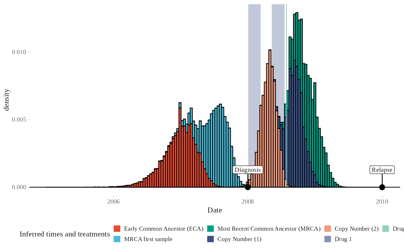
Plot clinical timeline + posterior times with MAP
Value
posterior distributions of the inferred timing variables on the clinical timeline (alternative visualisation)
Examples
data("exampleFit")
plot_timing_MAP(exampleFit)
#> Warning: Dropping 'draws_df' class as required metadata was removed.
#> No id variables; using all as measure variables
#> Joining with `by = join_by(variable)`
#> Scale for y is already present.
#> Adding another scale for y, which will replace the existing scale.